

Deciding Less So I Can Create More

Some days I have the energy to make art.
Other days I only have the energy to decide how not to make decisions.
Decision-making costs energy. When your energy is limited, even small preliminary choices like choosing a color palette can quietly drain the part of you that wants to make something. I’ve learned the hard way that if I don’t protect that energy, I don’t make art at all.
I think of this as decision fatigue. And art is about making decisions. But too many small choices, too close together, before I even start and the practice collapses under its own weight. So, I started looking for ways to offload decisions without flattening the work or making it feel generic.
Like choosing a color palette.
Two Ways I Offload Color Palette Decisions
Option 1
The first thing that worked was surprisingly ordinary. Whenever I’m in a hardware or paint store, I grab the pre-made color palette cards in the paint section. You know, the ones designed to help someone choose coordinated wall paint colors for their entire home without overthinking it.
I don’t have to decide if these colors “work” together. Someone already did that, and that’s the point.
The video walks through how I use these color cards.
Pre-made color palettes usually contain some version of the primary colors: red, blue, and yellow. If these colors happen to mix together on my project, they will make happy accidents by turning into secondary colors: orange, green, and purple. This is especially true for watercolors and part of their fun.
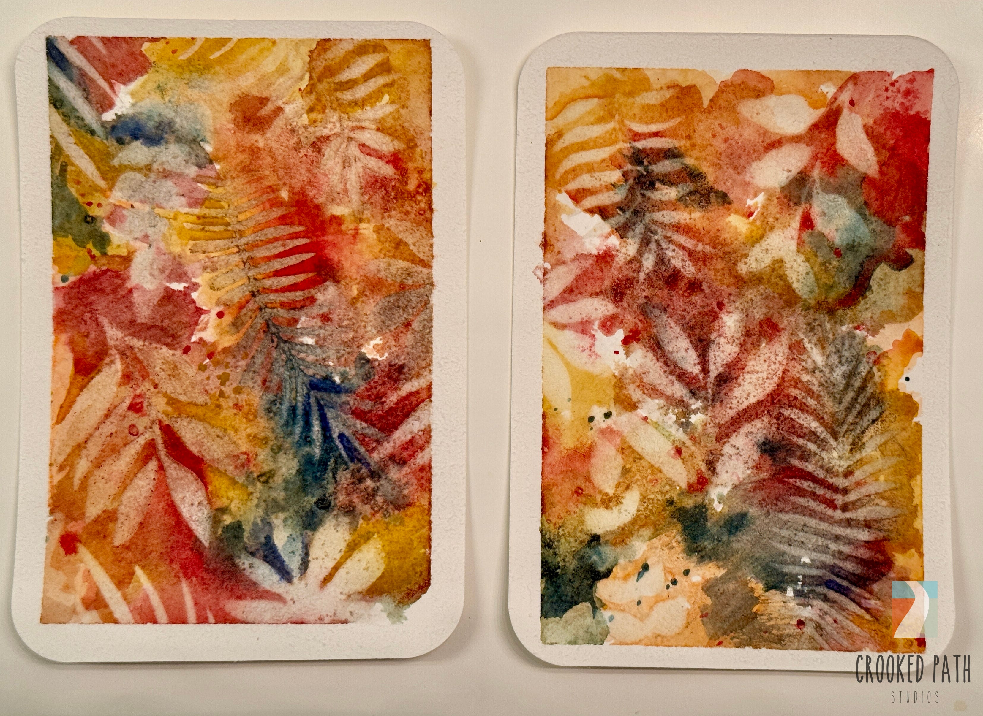
The paint cards often contain a variety of values, a light, a medium, and a dark, along with at least one neutral color like grey. There is enough variety to explore on the card, and you don’t have to use every color on the card in one project.
Option 2
I keep a Pinterest board of color palettes that I’m drawn to because they convey a specific mood, like Sea Glass or Fall, or they are colors I would never put together. Some are monotone (variation of one color) with a pop of a contrasting color that stands out.
How I Use the Palettes
For acrylics, I buy paint that roughly matches the colors on the palette. I do very little color mixing for acrylic paint. They dry too fast and, especially if I am Gelli printing, I want to grab the color without having to mix it first.


When I work from a Pinterest palette, I don’t try to recreate it exactly. I match what I already have as closely as I can and let the palette act as a boundary, not a rule.
The constraint is what makes starting easier.
Both of these options do the same thing for me: they remove the first energy barrier so I can spend my energy on the creative practice. What comes next is just about making that decision stick.
Creative Freedom
We’re taught to think of color choice as creative freedom. But for many of us, too much freedom becomes friction. Or worse, we freeze and can’t make a decision.
When energy, attention, or cognition are limited, every extra decision asks for more than we can reasonably give. Over time, that’s how practices quietly fall away. Not because we’ve lost interest, but because they ask too much at the wrong moment.
I have also used these methods to challenge myself to use colors I generally do not like. In many cases, exploring a palette across several projects has changed my understanding of a color and my appreciation of it. Because limiting our color choices to only the colors we “like” means we are limiting our self-expression.
Making color palette selection easier isn’t about lowering standards. It’s about designing a practice that can survive real life: flare days, brain fog, grief, and the rest of life (chocolate, cats, friends, and walks).
I use Pinterest as a decision-saving device, not an inspiration machine. The palettes I work with live on the Crooked Path Studio Color Palettes board, if you want to make this step easier.
Practical Applications
After I choose a palette, I set things up so future-me doesn’t have to think about it again.
Not only do I roughly match the paint, but I will also go through my other media and select crayons, oil pastels, collage papers, fabric and other media that match the color palette.
This way everything within reach on my desk is from that palette and I know whatever I make the colors will “go together.” Not only does this save me from hunting for supplies (a.k.a. energy), but it also means the materials can inspire me because they are in sight.
I will also do a page in my palette grid journal to see how the colors play together. Each color looks different when juxtaposed with another color. I find this a great way to learn more about how color works. If I am working on a quilt, I match the color palette to the fabric in my stash.


I used pre-made color palettes for all the quilts below.


I hang the paint card palettes and Pinterest color swatch palettes on the wall in my studio because that removes any friction of selecting a palette. I can let my mood or curiosity lead. And I make sample color swatch cards for each of the paints I buy, both acrylic and watercolor, and for the other media. I make these swatch cards while watching hockey and find them very therapeutic. They save me time (and energy) matching media to color palettes in the future.


Staying Curious
This is one of the ways I build a practice that can survive my real life. We’ll keep layering these kinds of shortcuts as we go. The next few might focus on color mixing for watercolors, or other ways to stay curious without getting technical.
You don’t need all of them. One is enough to start.
If this post resonated with you, I appreciate you sharing it with your friends here on Substack or other social platforms. Don’t forget to restack this post!
Crooked Path Studios is completely community supported. Here’s how you can support this work and other women with rare chronic illness.
There will always be a free Unfolding Path tier for short therapeutic practices, studio reflections, and my reflections on the latest arts and health research and its implications for those of us with chronic illness.
Be part of the community and have access to all upcoming workshop series, live virtual community events, group sessions, and other community events by joining the Wayfinding tier.
If you want to support this work without a monthly subscription, such as join workshops a la carte, schedule a 1:1 therapeutic practice, or buy me a paint brush then please visit my Crooked Path Studios shop by clicking the button below.
Nice!